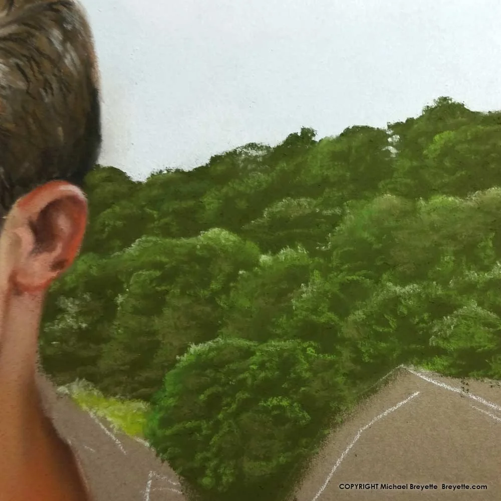
"Catch" and re-release.

When I'm working on a painting, I sometimes will go back and redo, or make changes to parts I consider 'finished' in order to blend with what I've added since. Often this has to do with lighting, and reflections of colors etc. On a rare occasion I complete and even release the painting before realizing (or acknowledging that voice in the back of my head) that something needs to be reworked.  Such has been the case with "Catch". 

I think, that because I liked all the elements separately, the face, the body, swimsuit, sunset background etc. I didn't really see the big picture and how they worked together. Since I was happy with all the elements, and had put all that time into it, I guess I convinced myself I was satisfied. 

However, a few months after releasing it, I took it off the website. I finally admitted I wasn't satisfied, and if I wasn't, I didn't want it out there. I let is sit for a year. I guess it took me that long make the hard choice, let go of the attachment to my creation and take the eraser to it.

One thing I wanted to do was make the lighting effect on the figure more dramatic. That meant some adjustments to the face, and since there were other things I wanted to change about the face, the whole face had to go. I also had to add more highlight to the left leg, and wanted to give his legs a bit more movement. So the swimsuit/hips needed a bit more tilt. This time I went with a yellow suit. Yellow is a bolder color and it lends a connection with the Sun, which is just out of the scene.

While it does feel odd to rework a painting that I've already shown to the world, it's not that strange. Musicians do it with their songs and George Lucas has done it with his movies. And while some may say they liked it better before, for me I made the right decision because of how I used to feel about "Catch" compared to how I feel now, I love it!

On the Drawing Board: Building a forest with pastels

In art it's usually easier to create a forest than it is a tree.  For the tree covered hills in the background I first filled in the area with a dark forest green, and rubbed it in with my finger to fill in all the fiber of the paper.  Next I used a brighter green to shape out the trees.  I only used my finger to drag the edge of the brighter green into the dark, but kept the hard top edge so the trees had form, otherwise it's just a blurry green mass.  A couple even lighter greens were used to add secondary highlights to the tips and a drab brownish-green was used for showing leafy branch clusters in the shadowed areas. 

If I had thought of it, I would have taken pics of the steps I used and posted them as well.